
Let’s get straight to it. If there’s one number you need to remember for your YouTube thumbnail size, it’s 1280×720 pixels.
This dimension is the golden rule. It ensures your thumbnail looks sharp and professional everywhere, from a phone screen to a smart TV. This 1280×720 resolution perfectly matches the standard 16:9 aspect ratio—the same widescreen shape as most videos—so you won’t have to worry about stretching or ugly black bars.
Why Are These Specs So Important?
Your thumbnail is your video’s billboard. It’s the single most important visual that convinces someone to click your video over others. Getting the technical details right is the foundation for making a great first impression. These aren’t just arbitrary rules; they’re practical steps to make your thumbnail work hard for you.
When your YouTube video thumbnail is properly optimized, it’s clear, crisp, and communicates your video’s value instantly. Even though it looks small in search results, YouTube often displays it in larger formats, like on the homepage or in the sidebar. Starting with a high-quality 1280×720 image means it scales down beautifully without ever looking blurry or pixelated.
The Unbreakable Rules of Thumbnail Tech
To ensure your thumbnail uploads flawlessly and looks amazing every time, nail these three key specs. They are non-negotiable for any successful YouTube channel.
Here’s a quick visual breakdown of what you need to know:
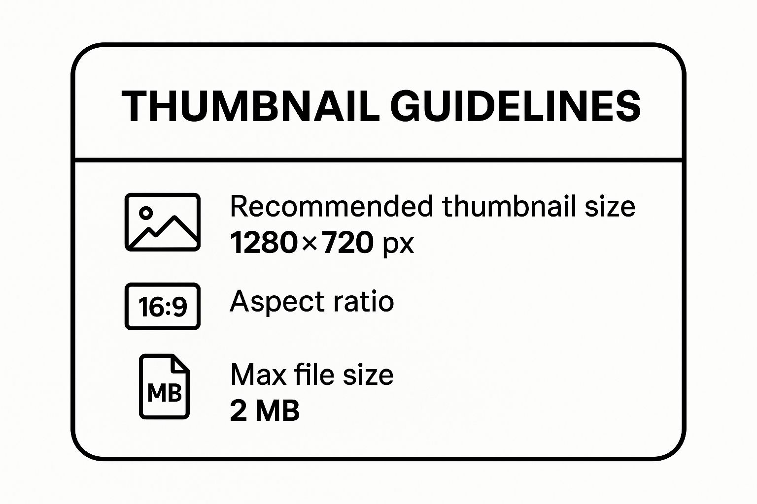
These three elements—dimensions, aspect ratio, and file size—work together. The 1280×720 resolution gives you high-definition quality, the 16:9 ratio keeps the shape right, and keeping the file size under 2MB guarantees it loads in a flash for every viewer.
For a quick reference, here are the essential specs in a simple table. Bookmark this page or screenshot the table—it’s all you need for the perfect YouTube thumbnail size.
YouTube Thumbnail Quick Reference Guide
| Specification | Recommendation | Why It Matters |
|---|---|---|
| Resolution | 1280×720 pixels | Ensures your image is high-definition and looks crisp, even when displayed in larger sizes. |
| Aspect Ratio | 16:9 | Matches the standard YouTube player, preventing distortion or ugly black bars on the sides. |
| File Formats | JPG, PNG, GIF | JPG is best for quality and small file size. PNG is for designs with transparency. |
| File Size | Under 2MB | Guarantees fast loading times for viewers and prevents upload errors on YouTube. |
This table covers the technical bedrock of every great thumbnail. Nail these, and you’re already ahead of the game.
Choosing the Right File Format
Beyond the size and shape, the file type you save your thumbnail as also matters. YouTube accepts a few, but for practical purposes, you only need to worry about two.
- JPG (or JPEG): This is your go-to for 99% of thumbnails. It hits the sweet spot of great image quality with a small file size, making it easy to stay under the 2MB limit.
- PNG: Use PNG only when your design has transparent elements, like a cutout of a person without a background. PNGs are great for this, but their file sizes can be larger, so monitor it.
- GIF: You can upload a GIF, but it’s not a good idea for a video thumbnail. They are often distracting, have large file sizes, and don’t perform well. Stick to static images.
A simple rule of thumb? Start with JPG. Only switch to PNG if you need transparency. No matter which you choose, always make sure your final file is under that 2MB limit.
Never settle for YouTube’s auto-generated thumbnails. They are almost always blurry or unflattering screenshots. A custom thumbnail is one of the most powerful tools to grow your channel and signals to viewers that you care about your content. It’s worth every second of effort.
Why Your Thumbnail Is Your Most Powerful Tool Today
To understand why the perfect YouTube thumbnail size and a killer design are so crucial, it helps to look back. The evolution of the YouTube thumbnail shows how the platform—and viewer expectations—have changed. It’s a masterclass in adaptation.
In the beginning, creators had no say. YouTube would grab a random, often blurry, frame from your video and make that the thumbnail. This often resulted in an unflattering still that did nothing to entice viewers.
The Shift to Creator Control
Around 2010, things started to change. YouTube gave creators some control, allowing them to choose from a few pre-selected frames. This was a huge step forward but also kicked off a ‘wild west’ era. Some creators, chasing views, began using shocking or misleading images, a practice you can learn more about in YouTube’s official creator playbook.
This period taught everyone a valuable lesson: a thumbnail that gets the click but fails to deliver on its promise creates a bad viewer experience. That realization reshaped how YouTube recommends videos.
From Clicks to Satisfaction
By 2013, the YouTube algorithm grew smarter. It began looking past simple click-through rates and started focusing on metrics that signal viewer satisfaction.
The big shift was from “Did they click it?” to “Did they like what they clicked?” This made watch time and audience retention king, forever changing the role of the thumbnail. A bait-and-switch thumbnail might get the initial click, but it would destroy your watch time when viewers left seconds later.
This evolution is why honest, well-designed thumbnails are non-negotiable now. The algorithm rewards content that delivers on the promise made by its thumbnail. Today, a great thumbnail has two jobs:
- It grabs a person’s attention: It must stand out with striking visuals, readable text, and emotion.
- It proves its value to the algorithm: A high click-through rate followed by strong watch time tells YouTube your thumbnail is an accurate preview and you’re making viewers happy.
This isn’t just history; it’s the foundation of any successful YouTube strategy. Your thumbnail is a promise to your audience and a key signal to the algorithm. Nailing the YouTube thumbnail size and design shows both people and the platform that your video is worth watching.
Should You Use a Higher Resolution Thumbnail?
While YouTube’s official recommendation for thumbnail size is 1280×720 pixels, many successful creators are exceeding this standard. They intentionally create thumbnails at a full 1920×1080 pixels.
So, why go the extra mile? It provides a subtle yet powerful competitive edge. A 1280×720 thumbnail is a good photo. A 1920×1080 thumbnail is the same photo shot with a better camera lens—it’s sharper, clearer, and packed with more visual information.
When you upload a higher-quality image, you give YouTube’s algorithm more data. Sharper text, clearer facial expressions, and defined objects can help the system better understand your video’s content, which is crucial for discovery.
Future-Proofing Your Visuals
Technology moves fast. Screens on our phones, TVs, and monitors are only getting sharper. A thumbnail designed at 1920×1080 today is a smart way to future-proof your channel.
By starting with a higher-resolution file, you ensure your back catalog of videos will continue to look crisp for years to come. This extra effort now prevents your channel from looking dated as display technology improves.
The golden rule is simple: you can always scale a big image down without losing quality. But you can never scale a small image up without it becoming a blurry, pixelated mess.
This matters when YouTube features your video on the homepage or when someone browses on a 4K TV. In those cases, your thumbnail is displayed much larger, and high-resolution quality truly shines.
Giving the Algorithm More to Analyze
The benefit isn’t just for the human eye. YouTube’s discovery system constantly scans visual data to understand what your video is about and who to show it to.
Feeding it a 1920×1080 image gives the algorithm a richer file to analyze. This can lead to better recognition of faces, objects, and text on your thumbnail. According to some experts, this richer data helps the system categorize your video more accurately. You can find more creator insights on how visual data is used in this creator community discussion on Pinterest.
This doesn’t mean a 1280×720 thumbnail is a bad choice—it’s still the official standard. But think of using 1920×1080 as a pro-level optimization. It’s a small tweak that serious creators use to maximize performance.
So, should you make the switch? If you’re serious about growing your channel, the answer is yes. It’s a minor change to your workflow that signals a commitment to quality and can pay off in the long run.
How to Design Thumbnails That Actually Get Clicks
You’ve mastered the correct YouTube thumbnail size. That’s the technical part. But nailing the design? That’s where the magic happens. Your thumbnail is the most important ad for your video. Its job is to grab attention and make people need to click.
This isn’t about becoming a world-class graphic designer overnight. It’s about understanding a few core principles that consistently work.

Picture the YouTube homepage. It’s a loud, crowded space where everyone is shouting for attention. Your thumbnail needs to pop, and that starts with understanding how people see and react to images in a split second.
Create an Instant Human Connection
Want a powerful shortcut to getting noticed? Put a face in your thumbnail. Our brains are hardwired to lock onto human faces and read their emotions. It’s an instant, subconscious connection that a simple graphic or text can’t match.
For the best results, use a clear, close-up shot showing a strong emotion. Are you surprised? Excited? Confused? Whatever emotion ties into your video’s story, put it front and center. This makes your thumbnail feel personal and creates immediate intrigue. A high-quality, expressive photo will always beat a blurry screenshot from your video.
Leverage High-Contrast Colors
On a cluttered feed, color is your best friend. High-contrast colors make your thumbnail visually leap off the page. Think bright text on a dark background, or a vibrant subject against a muted one. This contrast draws the eye and makes your design easy to understand at a glance.
The goal is to be instantly readable and visually striking. If a viewer has to squint to figure out what they’re seeing, you’ve already lost them. Strong contrast gets your message across in a fraction of a second.
This doesn’t mean you have to use blinding neon colors. It’s about creating a clear visual separation between your thumbnail’s elements. A simple trick is to put a dark overlay on your background image to make your text or face pop. To see what’s working, check out top creators in your niche. You can even use a tool like our free Chrome extension, Thumb Scout, which shows performance scores right on YouTube, revealing the color combos that win clicks.
Master the Art of Bold, Readable Fonts
The text on your thumbnail must work hard. It needs to be punchy and, most importantly, legible—especially on a small mobile screen. This makes your font choice critical.
Stick to these simple rules for text that works:
- Go Big and Bold: Use thick, heavy sans-serif fonts. Avoid thin, scripty, or fancy fonts that become unreadable when shrunk down.
- Keep It Short: This is key. Don’t cram your entire video title onto the image. Stick to 3-5 powerful words that spark curiosity or promise a clear benefit.
- Ensure Readability: Place your text on a solid color block or add a drop shadow/outline. This makes it stand out from the background, no matter how busy the image is.
Develop a Consistent Brand Style
As your channel grows, consistency is your secret weapon for building a loyal audience. A consistent brand style acts as a visual signature, helping your subscribers spot your content instantly.
Here’s what that looks like in practice:
- Using a consistent color palette that feels like you.
- Sticking to the same font (or family of fonts) across your thumbnails.
- Using a similar layout, like always having your face on the right and text on the left.
- Placing your logo in the same spot every time (avoid the bottom-right corner, where YouTube’s time stamp goes).
This consistency builds trust and recognition. When fans see that familiar style, they’re more likely to click because they already know and trust your content. Your thumbnail becomes part of a recognizable series that reinforces your brand with every upload.
Common Thumbnail Mistakes That Hurt Your Views
You can pour your heart into making an incredible video, but if your thumbnail doesn’t pull its weight, all that hard work might go unnoticed. Simple, fixable thumbnail mistakes can crush your click-through rate (CTR), telling the YouTube algorithm that your video isn’t what people want to see.
Think of this as your personal troubleshooting guide. I’ll walk you through the most common blunders that kill views and show you how to fix them. By checking your designs against this list, you can ensure your thumbnails are working for you, not against you.
Mistake 1: Using Blurry or Low-Resolution Images
There is no faster way to look like an amateur than with a blurry, pixelated thumbnail. This often happens when someone grabs a low-quality screenshot from their video or tries to stretch a small image to fit the 1280×720 frame.
Your thumbnail will appear on massive 4K TVs and tiny phone screens. A fuzzy image instantly signals that the video itself is low-quality, and most people will keep scrolling.
- The Actionable Fix: Always start with a high-resolution source image. If you pull a still from your video, export a single frame at full resolution from your editing software. Better yet, take high-quality photos specifically for the thumbnail while you’re filming for maximum sharpness and clarity.
Mistake 2: Cramming Way Too Much Text
Your thumbnail is a billboard, not a book report. A huge mistake is trying to squeeze your entire video title onto the image. On a mobile device—where over 70% of YouTube views happen—that text becomes an unreadable mess.
If a viewer has to squint to understand your thumbnail, you’ve already lost them. Simplicity is key.
My rule of thumb? Use no more than 3-5 powerful words. Your goal isn’t to explain the video; it’s to spark curiosity or promise a benefit that makes someone need to know more. Let your title do the rest of the work.
This approach makes your message hit home instantly. The text should support the visual, not fight it for attention.
Mistake 3: Choosing Unreadable Fonts and Colors
This is a close cousin to the “too much text” problem. Even if your text is short, it’s useless if no one can read it. Using thin fonts or placing light-colored text on a light background creates a low-contrast design that blends into the noise of the YouTube homepage.
Your design must grab attention and be understood in a split second.
- The Actionable Fix:
- Fonts: Go for thick, bold, sans-serif fonts. They’re clean, modern, and stay perfectly legible even when shrunk down.
- Colors: Use high-contrast color combos that pop. Think bright yellow text on a dark background, or white text inside a solid-colored box to lift it off the image. The goal is to separate the text from the background so it can be read effortlessly.
Mistake 4: Creating Misleading Clickbait
This is the most dangerous mistake because it demolishes viewer trust. We’ve all seen thumbnails with an over-the-top or completely fake image designed to trick you into clicking. You might get a short-term bump in clicks, but your watch time will tank as angry viewers leave within seconds.
A high bounce rate sends a terrible signal to the YouTube algorithm, hurting your channel’s reputation and getting your videos recommended less. The algorithm is all about viewer satisfaction, and misleading thumbnails are the opposite of that.
- The Actionable Fix: Be authentic. Your thumbnail should be an exciting but accurate preview of your content. Build intrigue, highlight the most compelling moment, but never lie. Building a loyal audience is about delivering on your promise, and that promise begins with an honest thumbnail.
Finding the Right Tool to Create Your Thumbnails
You don’t need to be a professional designer or spend a lot of money on software to make a killer thumbnail. Some of the best tools are user-friendly and won’t cost you a dime. It’s about finding the right fit for your skills, budget, and creative goals.
Think of this as building a simple, repeatable system. Once you find a tool you love, you can produce great-looking, on-brand thumbnails quickly. That consistency saves you time and helps your audience recognize your videos at a glance.
Powerful Software for Total Control
If you want to control every single pixel, professional desktop software is your best bet. These are the heavy hitters, packed with features for deep photo editing, custom graphics, and complex layered designs.
- Adobe Photoshop: This is the industry standard for a reason. Photoshop gives you ultimate power to manipulate images, fine-tune colors, and build incredible designs. It’s the go-to for creators serious about graphic design who want zero limitations. The trade-off is a steep learning curve and a monthly subscription.
Easy-to-Use Online Platforms
Looking for something quick, easy, and effective? Web-based design platforms are your best friend. They are built around drag-and-drop simplicity and are loaded with templates already perfectly sized for YouTube.
These tools are fantastic for beginners or any creator who needs to make great thumbnails fast without getting lost in technical settings.
The secret sauce for these platforms is their massive libraries. You get access to countless pre-made templates, fonts, and stock photos, which takes the guesswork out of the equation. You can create a professional-looking design in minutes, even with no prior design experience.
A Quick Look at Popular Thumbnail Tools
To help you pick the right tool for your workflow, here’s a quick breakdown of some of the most popular options. Each one has its own strengths, so consider what you need most—speed, collaboration, or a giant library of assets.
| Tool | Best For | Key Features | Price |
|---|---|---|---|
| Canva | All-around ease of use and a massive template library. | Intuitive drag-and-drop editor, millions of stock assets, and team collaboration features. | Free (with a robust Pro plan) |
| Snappa | Speed and simplicity for creators who need to work fast. | Pre-sized templates, thousands of HD photos, and a simple interface. | Free (with paid plans) |
| Figma | Collaborative design and creating reusable templates. | Vector-based editing, powerful component system, and real-time team collaboration. | Free (with professional options) |
Ultimately, the “best” tool is the one that you’ll actually use. Try the free versions of a few platforms to see which one clicks with your creative style.
Creating Thumbnails on the Go
Inspiration doesn’t always strike at your desk. Sometimes you need to create and upload a thumbnail straight from your phone, and mobile apps have become incredibly powerful.
Apps like Canva’s mobile version, Adobe Express, or Picsart are perfect for making quick edits, adding text, and getting a polished thumbnail ready for upload without a computer. This is a lifesaver for vloggers or anyone who is constantly on the go. The right tool means you can stay consistent, no matter where you are.
Answering Your Burning Thumbnail Questions
Even after you’ve nailed down the basics, unique questions pop up as you manage your channel. Let’s dig into some of the most common questions creators have about their YouTube thumbnails.
Can I Revive an Old Video Just by Changing the Thumbnail?
You absolutely can. It’s a low-effort, high-impact strategy. If you have an older video that you know is a gem but never took off, a new thumbnail can act as a relaunch.
A fresh design can grab the attention of subscribers who missed it the first time. More importantly, it signals to the YouTube algorithm that something is new, which can prompt it to show your video to a new audience. It’s a fantastic way to get more mileage out of your best content without re-shooting a single frame.
What’s the Best Way to A/B Test Thumbnails?
This is a great question. While YouTube is slowly rolling out a built-in testing feature, most creators don’t have it yet. But don’t worry, you can still run a solid test manually.
Here’s the simple method:
- Launch your video with “Thumbnail A.”
- Let it run for 24 to 48 hours and note the click-through rate (CTR) in your analytics.
- Then, swap in “Thumbnail B.”
- Let that run for another 24-48 hours and compare the CTR.
The secret is to only change the thumbnail. Don’t touch the title or description. This way, you can be confident that any change in your CTR is because of the new design.
It takes patience, but this approach gives you real, actionable data about what your specific audience clicks on.
Are Animated GIF Thumbnails a Thing?
Nope, not anymore. You might remember a time when some thumbnails would animate when you hovered over them, but YouTube has retired that feature.
While the platform technically lets you upload a GIF, it will only show the very first static frame. So, save yourself the trouble and stick with a high-quality JPG or PNG file.
Why Does My Awesome Thumbnail Look Blurry on YouTube?
This is a frustrating one. You upload a crystal-clear 1280×720 image, but on YouTube, it looks a little fuzzy. The culprit is almost always compression.
YouTube automatically compresses every image to ensure the site loads quickly for everyone. Unfortunately, this process can smudge fine details and low-contrast text.
The best way to fight back is to design for compression. Think bold, high-contrast fonts, simple layouts, and clear, powerful images. When your key elements are strong and distinct, they’ll survive the compression and stay sharp for every viewer.
Ready to stop guessing and start knowing which thumbnails are pulling in the clicks? Thumb Scout is a free Chrome extension that shows you real-time performance scores right on top of YouTube thumbnails. See what’s working for top channels, analyze your own, and make smarter design choices backed by data. Install Thumb Scout for free and give your channel the edge it deserves.
Article created using Outrank