In the crowded world of YouTube, your thumbnail is your first, and often only, chance to make an impression. It’s more than just a preview image; it’s a digital billboard competing for eyeballs. A great thumbnail can be the difference between a viral hit and a video that never gets seen, making it a critical component of your content strategy. It promises value, sparks curiosity, and sets the tone for the video within.
But what separates a good thumbnail from a great one? It’s not just about flashy graphics or bright colors; it’s about strategy, psychology, and data. In this guide, we’ll break down 7 powerful YouTube thumbnail examples that consistently perform well and provide actionable insights to help you grow. We’ll analyze why they work, how you can adapt them for your niche, and how to spot winning trends.
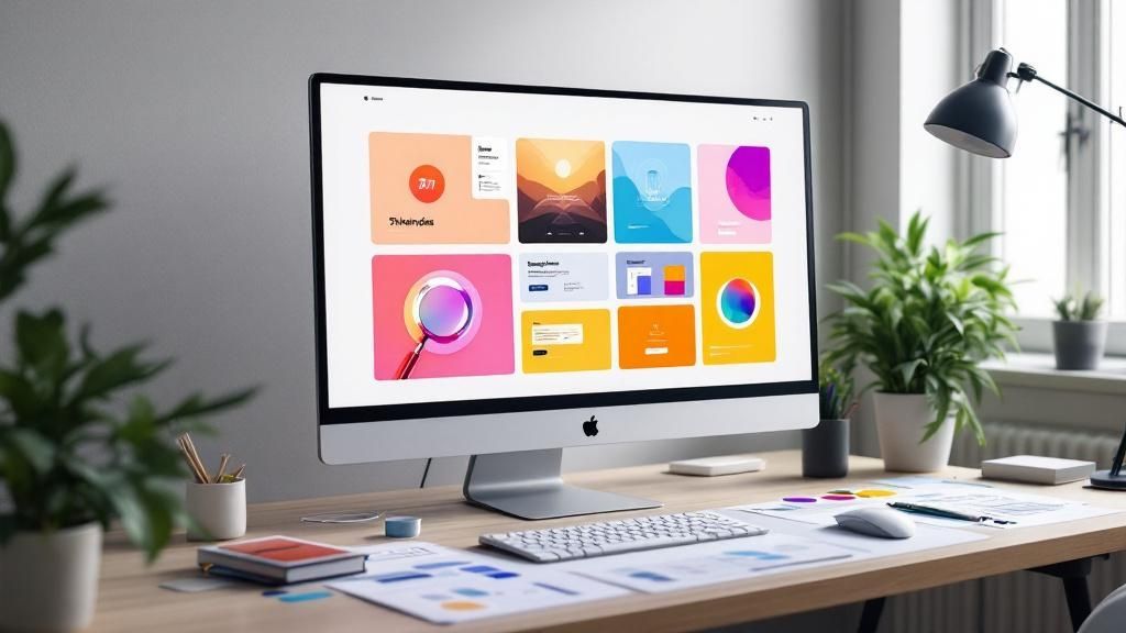
To understand what’s currently working, you need real-time data. That’s where a tool like Thumb Scout becomes invaluable, helping you analyze top-performing designs.
1. The Red Arrow/Circle Highlight Thumbnail
You’ve seen this one everywhere, and for good reason: it works. The red arrow or circle highlight is a foundational technique in the world of high-performing youtube thumbnail examples. It’s a simple, direct, and incredibly powerful way to command a viewer’s attention and tell them exactly what to focus on.
This design leverages a core principle of human psychology: our brains are wired to notice contrast and follow directional cues. By placing a bright red arrow or circle on a specific part of the image, you instantly create a focal point. This simple shape cuts through the visual noise on a crowded YouTube homepage, answering the viewer’s subconscious question: “What is this video about, and why should I care?”
Strategic Breakdown
The effectiveness of this style lies in its simplicity and clarity. It doesn’t ask the viewer to think; it guides them. This is crucial on a platform where you have mere seconds to make an impression.
- Creates Visual Hierarchy: The arrow or circle immediately establishes the most important element in the thumbnail. You are controlling the narrative from the very first glance.
- High-Contrast and Visibility: Bright red pops against almost any background, ensuring your thumbnail is noticeable even when shrunk down to a tiny size on a mobile device’s screen.
- Generates Curiosity: By pointing to something, you inherently create a question in the viewer’s mind. “What is that? Why is it circled?” This curiosity gap is a powerful motivator for a click.
Actionable Takeaways
Ready to try this classic technique? Here’s how to create thumbnails that get more views:
- Be Intentional: Don’t just slap an arrow on your thumbnail. Ensure it points to the most compelling element that relates directly to your video’s hook.
- Keep it “Imperfect”: A slightly hand-drawn or wobbly shape often feels more authentic and human, grabbing attention more effectively than a perfect, sterile graphic.
- Combine with Emotion: Pair the arrow/circle with a strong human emotion. A face showing shock, surprise, or curiosity next to the highlighted object amplifies the thumbnail’s impact exponentially.
Key Insight: The goal isn’t just to point at something; it’s to create a story. The red arrow provides the visual cue, but the surrounding image and your facial expression provide the emotional context that drives the click. To see how top creators use this technique, get the free Thumb Scout Chrome extension to analyze thumbnails directly on YouTube.
2. The Split-Screen Comparison Thumbnail
The split-screen comparison is a storytelling powerhouse in the world of youtube thumbnail examples. It works by dividing the visual space to present a direct contrast, such as a “before and after,” a side-by-side product duel, or a “myth vs. fact” showdown. This design is incredibly effective because it instantly communicates the core value of the video.
This approach taps into our natural desire to compare and evaluate options. By placing two contrasting elements next to each other, you create a visual narrative of transformation or conflict. This immediately answers the viewer’s question, “What will I learn or see?” by showing them the outcome or the central conflict upfront, making it a highly persuasive reason to click.
Strategic Breakdown
The power of the split-screen thumbnail comes from its inherent clarity and ability to generate immediate intrigue. It’s a visual promise that the video will resolve the comparison presented.
- Communicates Transformation: For content like fitness journeys, home renovations, or skill tutorials, a before-and-after split screen is the ultimate proof of value. It shows the result, not just tells you about it.
- Simplifies Complex Choices: In tech reviews or product comparisons, this format helps viewers quickly understand the key differences. It frames the video as a definitive guide to making an informed decision.
- Creates Instant Conflict: You can use a split screen to pit two opposing ideas against each other. This creates a natural tension that piques curiosity and makes viewers want to see which one “wins.”
Actionable Takeaways
Want to leverage the power of comparison? Here’s a clear strategy for an effective split-screen thumbnail:
- Maximize Contrast: Use strong visual differences between the two sides. This could be in color, quality, emotion, or outcome. The greater the contrast, the stronger the impact.
- Use a Clear Dividing Line: A simple, clean line separating the two halves helps the brain process the information as a distinct comparison.
- Keep Text Minimal: Let the images do the talking. If you use text, make it short and punchy, like “Before” and “After,” or the product names.
Key Insight: The split-screen thumbnail excels when the video’s value is best shown through comparison. Focus on making the “after” side aspirational to create a powerful desire for the viewer to learn how you achieved that result. You can explore how leading channels use this technique with the Thumb Scout Chrome extension to gain inspiration.
3. The Exaggerated Emotion Face Thumbnail
Humans are hardwired to notice and react to other human faces, especially ones showing strong emotion. This thumbnail style capitalizes on that instinct brilliantly. The exaggerated emotion face is a staple in the library of powerful youtube thumbnail examples, leveraging our innate curiosity to make us wonder, “What could possibly cause that reaction?”

Popularized by gaming and reaction channels, this technique involves featuring a large, high-quality cutout of the creator’s face displaying a dramatic expression like shock, disbelief, or frustration. This emotional shortcut instantly communicates the video’s tone and promises a highly engaging moment, compelling viewers to click to find out the cause.
Strategic Breakdown
The power of this thumbnail lies in its ability to create an instant emotional connection and narrative hook. It bypasses logical analysis and appeals directly to the viewer’s empathy and curiosity.
- Leverages Mirror Neurons: When we see an emotion on someone else’s face, our brains subconsciously mirror that feeling. A look of shock on a thumbnail makes us feel a flicker of that same emotion, drawing us into the experience.
- Tells a Story Instantly: A single expressive face can convey a complex story. A shocked expression in a gaming thumbnail suggests an unexpected twist. It sets the stage and creates immediate intrigue.
- Stands Out in a Crowd: On a busy homepage filled with objects and text, a clear, emotive human face is a beacon. Good lighting and a clean background make the expression the undeniable focal point.
Actionable Takeaways
Want to use emotional storytelling to boost your clicks? Follow these practical tips:
- Authenticity is Key: Your expression must match the energy of the video’s most impactful moment. If you look shocked in the thumbnail, the video needs a genuinely shocking moment to deliver on that promise.
- Clarity Over Clutter: Use high-quality lighting to ensure your expression is clearly visible. Cut your face out from the background to make it pop, removing any distracting elements.
- Combine with Context: While the face is the star, a small background element can provide context. A hint of the game or product can amplify the story your expression is telling.
Key Insight: The most successful emotion-based thumbnails are a preview of the video’s peak emotional moment. They aren’t just clickbait; they are a promise of the entertainment inside. Capture authentic, high-energy reactions and frame them clearly to create an irresistible urge to click. You can analyze top-performing examples in your niche on Thumb Scout to see how creators balance emotion and context.
4. The Bold Text Overlay Thumbnail
Sometimes, the clearest message is the most powerful. The bold text overlay is one of the most effective youtube thumbnail examples because it prioritizes direct communication. Instead of relying solely on imagery, this technique uses large, easy-to-read text to instantly tell the viewer what the video is about and what value it offers.
This design philosophy is built on clarity and speed. In a sea of visual information, a thumbnail with a concise headline acts as a beacon. It answers the viewer’s core question, “What will I get from watching this?”, before they even read the video’s title. This approach is especially powerful for educational, how-to, and informational content where the benefit is the main selling point.
Strategic Breakdown
The strength of the bold text overlay lies in its upfront promise. It removes ambiguity and sets a clear expectation, which can significantly boost click-through rates from viewers searching for a specific solution.
- Communicates Value Instantly: Large, bold text immediately conveys the video’s primary benefit. Words like “HOW TO,” “5 MISTAKES,” or “THE SECRET TO” grab attention and frame the video’s purpose.
- Maximum Readability: By using high-contrast colors and simple, thick fonts, the text is legible even when the thumbnail is scaled down to a tiny size on a mobile phone. This ensures your message is never lost.
- Builds Authority and Trust: For educational and business channels, presenting a clear, confident statement in the thumbnail establishes credibility. It shows you know what your audience is looking for.
Actionable Takeaways
Want to make your message impossible to ignore? Here is a simple strategy for the bold text overlay:
- Keep it Short and Punchy: Limit your text to 3-5 words maximum. The goal is a headline, not a paragraph. Focus on the most impactful words that create curiosity or promise a clear benefit.
- Prioritize Contrast: Place light-colored text on a dark background or dark text on a light background. Use a solid color block or a subtle drop shadow to make the text pop.
- Test for Readability: Before you publish, shrink your thumbnail down to the size it would appear on a smartphone. If you can’t easily read the text in one second, it’s too complicated.
Key Insight: The text on your thumbnail shouldn’t just repeat your video title; it should complement it by providing the emotional hook or primary value proposition. Use the title for keywords and the thumbnail text for impact. For more tips on getting the dimensions and layout right, learn more about the ideal YouTube thumbnail size.
5. The Product Showcase Thumbnail
When the product is the star, let it shine. This thumbnail style is the go-to for reviews, unboxings, and any content where an item takes center stage. The Product Showcase is a clean, professional, and highly effective design among the best youtube thumbnail examples because it communicates value and subject matter with absolute clarity.
This design philosophy strips away unnecessary distractions, placing a high-quality image of the product against a simple background. Popularized by tech and beauty creators, this approach tells the viewer, “This video is a focused, in-depth look at this specific item.” It builds trust by signaling professionalism and expertise, making the viewer feel confident they are about to watch a high-quality review.
Strategic Breakdown
The power of this thumbnail lies in its directness and premium feel. It leverages the product’s own appeal to generate clicks, promising a detailed and authoritative look.
- Clarity and Focus: There is zero ambiguity. Viewers instantly know what the video is about, which is perfect for an audience searching for information on a specific product.
- Aspirational Quality: By presenting the product with clean lighting and crisp focus, you make it look desirable. This taps into the viewer’s desire for the item, making them want to learn more about it.
- Builds Authority: A sleek, professional thumbnail suggests a creator who takes their content seriously. This builds subconscious trust and positions the creator as an expert in their niche.
Actionable Takeaways
Want to make your products pop and pull in views? Follow this practical strategy:
- Prioritize Image Quality: Use a high-resolution, professionally shot photo of the product. The item must be well-lit, in sharp focus, and free of distracting reflections.
- Create Clean Backgrounds: Place the product on a simple, contrasting background. A solid color that complements your channel branding works well. This makes the product the hero of the image.
- Add Subtle Text & Your Face: Include minimal text like “Review” or the product name. Adding a small photo of yourself looking at the product can build a personal connection and increase trust.
Key Insight: This thumbnail isn’t just a picture of a product; it’s a carefully crafted advertisement for your video. The goal is to make the product look so appealing that a click becomes irresistible. Discover how top creators balance product imagery and personal branding with a tool like Thumb Scout.
6. The Bright Color Block Thumbnail
When you want to make a bold, modern, and immediate statement, the bright color block thumbnail is your go-to technique. This design leverages vibrant, saturated colors and clean geometric shapes to create a visual punch that is impossible to ignore. It’s one of the most effective youtube thumbnail examples for channels aiming for a sleek, energetic, and professional look.
This style works by tapping into color psychology and high contrast. Instead of relying on a busy scene, it uses large blocks of solid color to frame the subject or text, making it pop off the screen. This approach is perfect for cutting through the visual clutter of the YouTube feed, grabbing attention with pure, unadulterated color.

Strategic Breakdown
The power of the color block thumbnail is its intentional minimalism and psychological impact. It communicates a sense of order, confidence, and modernity, which is a perfect match for niches like tech, design, and productivity.
- Maximum Contrast and Readability: Placing bold text or a clean object against a solid, bright background creates maximum contrast. This ensures your title is readable even at the smallest sizes.
- Brand Consistency: By sticking to a defined color palette, you can make your videos instantly identifiable. When a subscriber scrolls through their feed, your consistent use of color acts as a brand signature.
- Mood and Tone Setting: Colors evoke specific emotions. A bright yellow can feel energetic, a deep blue can feel professional, and a hot pink can feel bold. This style lets you set the video’s mood before a single word is spoken.
Actionable Takeaways
Want to implement this clean, eye-catching style? Here are some simple tips to do it effectively:
- Limit Your Palette: Stick to two or three dominant colors per thumbnail to maintain a clean, uncluttered look. Use color theory to pick colors that work well together.
- Focus on Typography: With a simple background, your text becomes a key design element. Choose a clean, bold font that is easy to read and aligns with your channel’s brand personality.
- Use Shapes to Guide the Eye: Incorporate geometric shapes like circles or rectangles to frame your subject, highlight text, or lead the viewer’s eye.
Key Insight: The bright color block strategy isn’t about being random; it’s about being deliberate. Every color and shape should serve a purpose. You can find inspiration and analyze how top creators use color blocking by browsing on Thumb Scout. Get ahead by installing the Thumb Scout Chrome extension to see these strategies in action.
7. The Mystery/Curiosity Gap Thumbnail
Humans are naturally curious creatures. The Mystery/Curiosity Gap thumbnail preys on this fundamental trait, making it one of the most psychologically potent youtube thumbnail examples available to creators. This design deliberately obscures information or poses a tantalizing question to make a viewer desperately want to know the answer.
This technique is all about creating an itch that can only be scratched by clicking. It leverages what psychologists call the “curiosity gap”—the space between what we know and what we want to know. By hinting at a secret or a shocking outcome without giving it away, you generate an irresistible pull. This thumbnail style whispers, “There’s something important here, and you’re missing out.”
Strategic Breakdown
The power of this thumbnail lies in its ability to engage the viewer’s mind actively. Instead of just presenting information, it asks a question or presents a puzzle, immediately making the viewer a participant.
- Sparks Active Engagement: A mysterious image or a question mark forces the viewer to pause and think. “What’s in the box?” “What happened next?” This mental engagement is a powerful precursor to a click.
- Leverages Fear of Missing Out (FOMO): By hiding key information, you imply that the knowledge is valuable. This creates a sense of urgency, as viewers feel they might miss out on a fascinating story or reveal.
- Broad Emotional Appeal: Curiosity is universal. This thumbnail style works across countless niches, from true crime and commentary to tech reveals and personal vlogs.
Actionable Takeaways
Want to pique your audience’s curiosity? Here is a practical strategy for the perfect mystery thumbnail:
- Promise, then Deliver: Your video must satisfy the curiosity you create. If you promise a big reveal, make sure it’s worth the click. A failure to deliver is a quick way to lose audience trust.
- Use Strategic Obscurity: Employ shadows, blurring, censor bars, or question marks to hide the key element. Give just enough context for the viewer to understand the topic while still wondering about the outcome.
- Combine with Intriguing Text: A simple, question-based text overlay like “What’s Inside?” or “You Won’t Believe This…” can amplify the mystery created by the visuals.
Key Insight: The goal is to create a compelling question, not confusion. The thumbnail should be clear enough to signal the video’s topic but vague enough to leave the most critical part unanswered. You can find inspiration for your next mystery-style design by exploring top-performing thumbnails on Thumb Scout.
7 YouTube Thumbnail Styles Comparison
| Thumbnail Style | Implementation Complexity 🔄 | Resource Requirements ⚡ | Expected Outcomes 📊 | Ideal Use Cases 💡 | Key Advantages ⭐ |
|---|---|---|---|---|---|
| The Red Arrow/Circle Highlight | Low – simple shapes and colors | Low – basic graphic elements | High attention, curiosity, urgency | Tech reviews, tutorials, gaming, reactions | Instantly recognizable, mobile-friendly |
| The Split-Screen Comparison | Medium – requires balanced layout | Medium – multiple image elements | Clear content comparison, curiosity | Before/after, product/fitness comparisons | Communicates comparison instantly |
| The Exaggerated Emotion Face | Low to Medium – photo shoot needed | Medium – quality facial shots | Strong emotional connection, good engagement | Reaction, unboxing, gaming, lifestyle vlogs | Stops scroll, popular with algorithms |
| The Bold Text Overlay | Low – focus on typography | Low – text and simple background | Clear communication, high readability | Tutorials, education, business advice | Easy to create consistently, mobile readable |
| The Product Showcase | Medium – professional photos | Medium to High – product images | Professional trust, clear product focus | Product reviews, unboxings, fashion hauls | Looks trustworthy, consistent branding |
| The Bright Color Block | Medium – requires design skills | Medium – color and shape design | Eye-catching, brand recognition | Lifestyle, design, tech, education | Stands out, appeals to younger demographics |
| The Mystery/Curiosity Gap | Medium – creative concept required | Low to Medium – image/text combos | High curiosity, click motivation | Storytime, investigation, drama, mystery | Builds anticipation, higher CTR potential |
Turning Examples into Your Winning Strategy
We’ve just walked through a masterclass of youtube thumbnail examples, dissecting seven powerful archetypes that consistently drive clicks. From the clarity of the Bold Text Overlay to the psychological pull of the Mystery/Curiosity Gap thumbnail, a clear pattern emerges: a high-performing thumbnail is never an accident. It is a deliberate, strategic asset engineered to capture attention.
The most successful creators don’t just stick to one style; they master the fundamentals behind each. They understand when a video needs the direct comparison of a Split-Screen layout versus the raw human connection of an Exaggerated Emotion Face. They know that the right combination of bright colors, clean composition, and compelling text can mean the difference between a video that soars and one that stalls.
From Inspiration to Implementation
So, how do you translate these powerful examples into a winning strategy for your own channel? The journey from inspiration to implementation is paved with data-driven decisions, not guesswork. Merely copying a popular thumbnail without understanding why it works is a recipe for inconsistent results.
Your next steps should focus on building a repeatable system for creative excellence.
- Analyze, Don’t Just Admire: Instead of just saving a cool thumbnail, ask critical questions. What is the single most eye-catching element? How does the text create urgency or curiosity? What emotion does the color palette evoke?
- Adapt, Don’t Duplicate: Take the core principle of a great thumbnail and apply it to your unique brand. If you’re inspired by a reaction face, how can you adapt that to showcase genuine surprise about a new feature?
- Test Everything, Assume Nothing: The YouTube landscape changes constantly. A style that dominates today could be old news next month. Continuously test new ideas to find what resonates most with your audience right now.
The true takeaway from these youtube thumbnail examples is that you need a reliable method to spot trends as they happen. To do this effectively, you need real-time data. Stop guessing and start making informed decisions with a tool like Thumb Scout to see thumbnail performance scores in your niche, turning observation into a competitive advantage.
Ultimately, mastering the art of the YouTube thumbnail is mastering the art of the first impression. It’s your single best tool for convincing a viewer that your content is worth their time. By embracing the strategies we’ve discussed and committing to a process of continuous, data-informed improvement, you’re not just making better images. You are building a more successful, faster-growing channel. Start today by installing the free Thumb Scout Chrome extension and begin transforming inspiration into a repeatable, channel-growing strategy.
Ready to stop guessing and start creating thumbnails that get clicks? With Thumb Scout, you can instantly analyze any YouTube thumbnail, see its performance score, and uncover the creative strategies behind top-performing channels. Turn these youtube thumbnail examples into your own success story by using the same data the pros use.