
A great thumbnail is a powerful cocktail. You need to mix bold text, expressive human faces, and bright, contrasting colors into one single, can't-ignore image. This isn't just about looking pretty; it’s about making a visual promise. It tells a potential viewer, in a split second, what they're going to get. A killer thumbnail piques curiosity, stops the scroll, and is crucial for how YouTube's search algorithm discovers your content.
Why Your Thumbnail is the Ultimate First Impression
Long before anyone hears your intro or sees your B-roll, they see your thumbnail. Let's get one thing straight: a thumbnail isn't just a preview. It’s your single most powerful piece of marketing to convince someone to click on your video. Think of it as the cover of your book or the storefront for your content—it has to be compelling enough to win the click in a crowded YouTube search results page.
This little image is where you set expectations. I’m not talking about clickbait, but about setting a clear, exciting promise that your video then delivers on. From my own experience, I can tell you that the time I spend designing my thumbnail is just as important as the hours I spend editing the video. It has a direct, measurable impact on my click-through rate (CTR) and overall channel growth.
The Psychology Behind the Click
So what makes some thumbnails so magnetic? It really comes down to a few psychological triggers that, when combined, make people stop and investigate.
- Emotion Connects Instantly: A human face showing a clear, strong emotion—like shock, joy, or confusion—creates an immediate connection. Viewers can't help but wonder what caused that reaction.
- Color Demands Attention: Bright, high-contrast colors are your secret weapon. Think yellow on black or bright red against a cool blue. These combinations make your thumbnail physically pop out in a sea of other videos, grabbing the viewer's eye.
- Text Adds Clarity: A few, carefully chosen words in a big, bold, easy-to-read font can spell out the video's main benefit or ask a question that needs an answer.
The numbers speak for themselves. YouTube has reported that 90% of the best-performing videos on the platform use custom thumbnails. That’s not a coincidence; it's a necessity. The best practices today all revolve around that proven formula: expressive faces, vibrant colors, and clear text that instantly communicate what the video is all about. You can even explore more on the evolution of the thumbnail industry to see how we got here.
At the end of the day, a fantastic thumbnail is what turns a passive scroller into an engaged viewer. Learning how to make one is less about being a Photoshop wizard and more about understanding human psychology. Want to see what’s working in your niche? Get actionable insights with Thumb Scout.
The Anatomy of a Thumbnail That Gets Clicks
Ever wonder what makes you click on one YouTube video over another? It's usually not an accident. The best thumbnails aren't just random screenshots; they're meticulously designed to grab your attention and make you curious. When you get the key ingredients right, you create something that stops people from scrolling.
Let's break down what actually works.
Composition: Guiding the Viewer's Eye
First things first, how you arrange elements in your thumbnail matters. A timeless guideline here is the rule of thirds. Picture a 3×3 grid overlaid on your canvas. Instead of dead-centering your main subject, try placing it along one of the lines or at an intersection. This simple trick instantly makes the image feel more balanced and professional.
Color and Emotion: The One-Two Punch
In a sea of other videos, color is what makes you stand out. You need to be seen. Think bold, high-contrast colors—a bright yellow against a deep blue, or a vibrant red that pops off the screen. This isn't about being obnoxious; it's about being visible at a glance.
But color alone isn't enough. You need to connect with the viewer on a human level. Nothing does this better than a clear, expressive face. When someone sees an expression of shock, joy, or intense curiosity, they feel an immediate emotional pull. They have to know what caused that reaction. If you're stuck for ideas, take a look at what the top channels in your niche are doing with a tool like Thumb Scout.
The big secret? Your thumbnail should spark a feeling before it ever conveys information. That split-second emotional gut-punch is what earns the click, long before a viewer even reads your title.
Text: Less Is So Much More
Finally, let's talk text. If you use it, make it count. Your font needs to be bold, clean, and ridiculously easy to read, even on a tiny phone screen. Forget fancy, cursive fonts.
Stick to just a few powerful words—three or four, max. Tease the core value of the video or ask a question that piques curiosity. The goal is instant comprehension, not a novel.
These are the pillars of a great thumbnail. Nailing these fundamentals is non-negotiable, and that includes the technical stuff. To make sure your hard work doesn't end up looking blurry, you'll want to use the right dimensions. We've got you covered in our guide on the perfect YouTube thumbnail size.
Once you get a feel for combining great composition, strategic color, human emotion, and punchy text, you'll be creating thumbnails that don't just get seen—they get clicked.
A Practical Guide to Creating Your Thumbnail
Alright, let's get our hands dirty and actually build a thumbnail. Forget the theory for a moment—this is where the real fun begins.
The first step doesn't even happen in a design tool. It starts with a simple question: What's the one thing I want viewers to take away from my video's title and thumbnail? Think about the most exciting, intriguing, or valuable part of your content and brainstorm a few visual ideas that capture that hook.
Picking Your Tools
Once you have a concept, it’s time to choose your creative weapon. You absolutely do not need to be a pro graphic designer to make killer thumbnails.
Tools like Canva are fantastic for beginners, packed with templates and super intuitive. If you're more experienced or want complete creative freedom, something like Adobe Photoshop gives you all the power you could ever need. Your choice really just boils down to what you're comfortable with.
Building Your Thumbnail, Layer by Layer
I like to think of thumbnail design like making a killer sandwich—it’s all about layering the right ingredients.
-
The Foundation: Start with a clean, high-quality background. This could be a simple color gradient, a slightly blurred scene from your video, or a relevant stock image. The goal is to make your main subject stand out, not get lost in a cluttered mess.
-
The Main Subject: This is the star of the show. Place your key visual—whether it's your face with an expressive emotion or a crystal-clear shot of a product—front and center. Make it big and impactful.
-
The Text: If you decide to add text, stick to just a few powerful words. Use a bold, easy-to-read font that grabs attention. Your text should add context to the visual, not fight with it for attention.
Speaking of technical details, here's a quick checklist I always run through to make sure everything is spot-on before uploading.
Thumbnail Technical Specification Checklist
| Specification | Recommendation | Why It Matters |
|---|---|---|
| Resolution | 1920×1080 pixels (16:9 aspect ratio) | Ensures your thumbnail looks sharp on all devices, from TVs to phones. |
| File Formats | JPG, PNG, GIF | These are the standard formats YouTube accepts. |
| File Size | Under 2MB | YouTube has a strict file size limit for uploads. |
Following these specs is non-negotiable for a professional look.
Here’s a great visual that breaks down how to choose the right tool based on your project's needs.
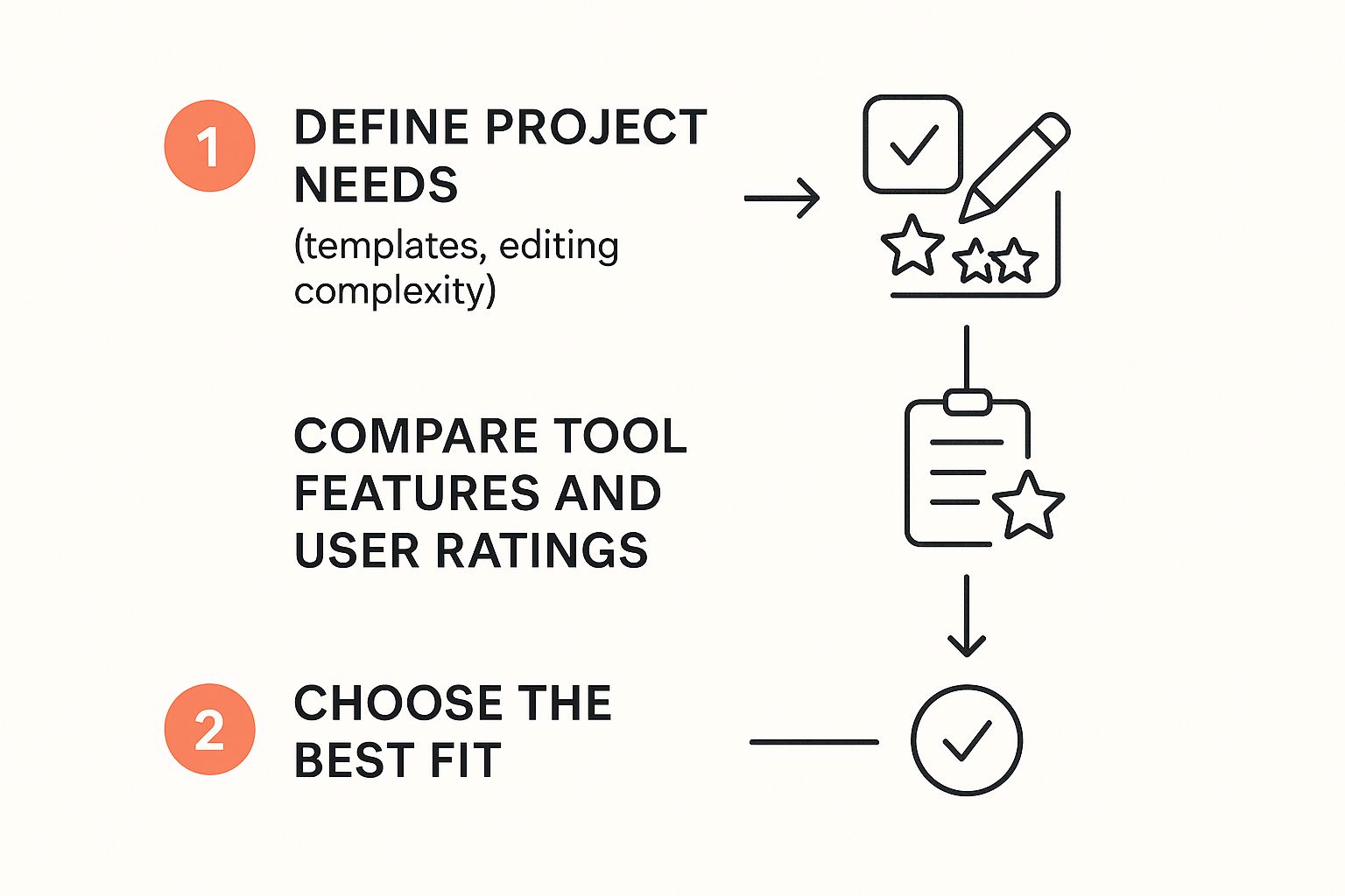
The main takeaway here is pretty clear: figure out what you need to accomplish first, and then pick the tool that makes it easiest for you.
Finally, don't forget your branding! A consistent color scheme, font choice, or a small logo in the corner helps your audience recognize your content in a crowded feed. It’s a small touch that builds a loyal following over time.
Once your masterpiece is ready, it's time to upload it. If you've never done it before or just need a quick reminder, we have a simple guide on how to change a video thumbnail on YouTube. Trust me, with a little practice, this whole process will become second nature.
The Right Tools for the Job
You don’t need to be a professional designer or have a huge budget to craft thumbnails that get clicks. Honestly, the right tools make all the difference, transforming a potentially frustrating task into a fun, creative part of your process. What you choose really comes down to your comfort level, budget, and how much granular control you want over the final look.
Investing in your visual toolkit is quickly becoming the norm. The digital content creation market—which includes all these design tools—is expected to jump from USD 27.1 billion in 2023 to a massive USD 49.5 billion by 2028. It’s clear that creators are taking their visual presentation more seriously than ever. You can dig into more of those numbers in this digital content creation statistics report.
Your Design Toolkit
If you're just dipping your toes into design, there are some fantastic, user-friendly platforms that feel like a godsend.
- Canva & Adobe Express: These are my top recommendations for beginners. They're packed with templates, have simple drag-and-drop interfaces, and offer massive libraries of stock photos and graphics to get you going quickly.
- Photoshop: For those of you who want ultimate control, Photoshop is still the undisputed king. Its powerful layering and editing capabilities give you the freedom to build a thumbnail from scratch, exactly how you envision it.
A big part of getting better is also understanding your own performance. It’s always a good idea to dive into your YouTube video analytics to see what’s resonating with your audience.
The best tool is the one you'll actually use consistently. Don't feel pressured to master a complex program if a simpler one helps you create amazing thumbnails without the headache.
Finding High-Quality Assets
A great design is only as good as its ingredients. The good news is, you don’t have to pay a fortune for them.
- Stock Photos: I constantly use sites like Unsplash and Pexels. They have enormous libraries of high-resolution, royalty-free images that make for perfect backgrounds or design elements.
- Fonts: Google Fonts is a treasure trove of free, web-safe fonts. You can find hundreds of clean, readable options that will make your text stand out.
Want to get a peek at what’s working for others right now? The Thumb Scout Chrome Extension lets you see top-performing thumbnails directly on YouTube.
When you bring all these resources together, you have a powerful setup for creating thumbnails that truly perform. Ready to see how the pros do it? Check out what top creators are up to with Thumb Scout.
Using Data to Perfect Your Thumbnail Strategy
Look, designing a thumbnail that you think is great is one thing. Knowing if it actually works is how you win the game. This is the moment you stop being just an artist and start thinking like a data-driven creator. You're moving from "I hope this looks good" to "I know this gets clicks." And it all starts inside your YouTube Analytics.
Your Click-Through Rate (CTR) is the most honest feedback you'll ever get. It’s your audience voting with their clicks. When that number is high, you're telling YouTube's algorithm that your thumbnail and title are a killer combo, which often leads to more impressions. A low CTR, on the other hand, is a red flag that something’s off. If you want to benchmark your numbers, we’ve put together a guide on what a good YouTube click-through rate really looks like.
Turning Insights Into Action
Don't just stare at the data—put it to work. One of the simplest, yet most powerful, things you can do is run your own A/B tests.
Go find an older video with a low CTR but solid audience retention. That’s your golden ticket. It means people who clicked liked the video, but not enough people were clicking in the first place. Design a brand-new thumbnail based on everything you've learned, swap it out, and watch what happens.
This isn't some fringe tactic; it's a core strategy for the biggest players. Netflix, for instance, famously shows different users different thumbnails for the same show based on their viewing history. Why? Because it works. To get a similar edge and see what’s actually performing in your niche right now, you can use a tool like Thumb Scout to make smarter, data-backed decisions.
The goal isn't just to make pretty pictures. It's to create visual assets that are scientifically proven to attract clicks. Your CTR is the ultimate judge of your thumbnail's success.
Adopting this mindset is so important because well-designed thumbnails are proven to boost your visibility and search ranking. If you're curious about the broader marketing impact, there are some great reads on making thumbnails attractive in digital marketing.
For an immediate advantage, the Thumb Scout Chrome Extension is a game-changer. It overlays performance scores directly onto thumbnails as you browse YouTube, giving you a real-time look at what your competition is doing right.
Common Questions I Hear About Getting Thumbnails Right
Even with the best tools and strategies, a few practical questions always pop up. Let's clear those up so you can get back to creating thumbnails that grow your channel.
Can I really make a good thumbnail on my phone?
Absolutely. Many mobile apps like Canva and Adobe Express are incredibly powerful now. For quick, clean designs, they're perfect. The key is to keep it simple—bold text, a clear subject, and high-contrast colors work great even on a smaller screen.
How do I find the right emotion for my face in the thumbnail?
Think about the core feeling of your video. Is it shocking? "SECRET REVEALED" would pair well with a wide-eyed, shocked expression. Is it a solution to a problem? A look of relief or excitement works perfectly. The emotion should match the promise of the video's content.
What’s the biggest mistake beginners make with thumbnails?
Making them too cluttered. Beginners often try to cram in too much text, too many images, or complex backgrounds. Remember the glance test: if you can't understand the thumbnail's main idea in one second, it's too complicated. Simplify, simplify, simplify.
Should my thumbnail text be the same as my video title?
No, they should complement each other. Think of them as a one-two punch. The thumbnail grabs attention with a visual hook and a few power words (e.g., "MISTAKE?"), while the title provides more context and SEO keywords (e.g., "The #1 Vlogging Mistake New YouTubers Make"). Using them together is a thought-provoking strategy that creates intrigue.
How much time should I spend making one thumbnail?
There's no magic number, but don't rush it. For top creators, it’s not unusual to spend 1-2 hours on a single thumbnail. Treat it as a crucial part of your content creation, not an afterthought. The ROI on a great thumbnail is massive.
What if my niche isn’t visual? How do I make an exciting thumbnail?
Get creative with graphics and text. If you have a podcast or a coding tutorial, you can use bold text, interesting icons, logos, or even a branded graphic template. Your face, expressing the core theme (e.g., frustration for a difficult problem, excitement for a solution), can still be a powerful anchor.